Journ'
Journ's Conception
I love journaling; it’s therapeutic to write down your thoughts and when reading past entries back, you take a hike down memory lane. As my days get busier and busier, however, even moving to pick up a pencil seemed like too much of a chore. I have tried many other journalling apps, but they always had features or distracting and inconsistent aspects I didn’t like. So, I thought, why should I compromise when I know what I want? As someone who loves a challenge, I decided to make a journaling app that’s fun to navigate and gives the users zero burden to use.
The problem
Some times having to find a pen or flipping to the right page is enough reason to procrastinate. This project eliminates all those distracting steps that deter the user from their actual task of writing as to not lose their initial inspiration in the process.
My solution
My design won't dazzle the users. Journ' creates a simple environment where the user comes to write their entries when they just want to write an entry. The lack of navigatory paths ensures the users will not be scared away by a list of potential decisions they would have to make when they just came for a simple task: writing.
Key Aspects
Easy and fun to navigate
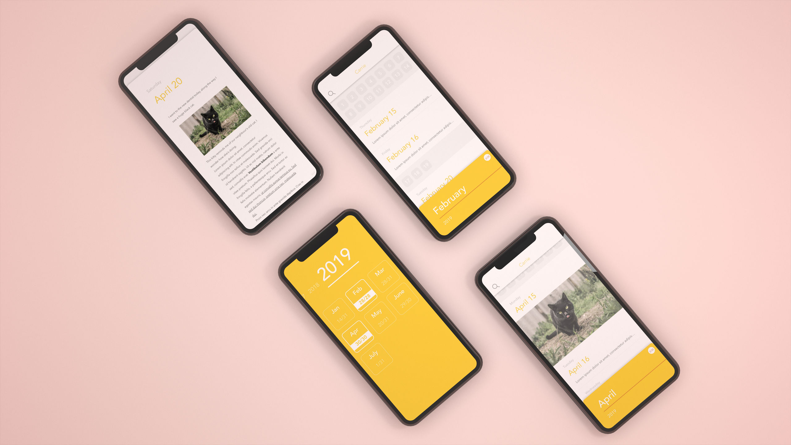
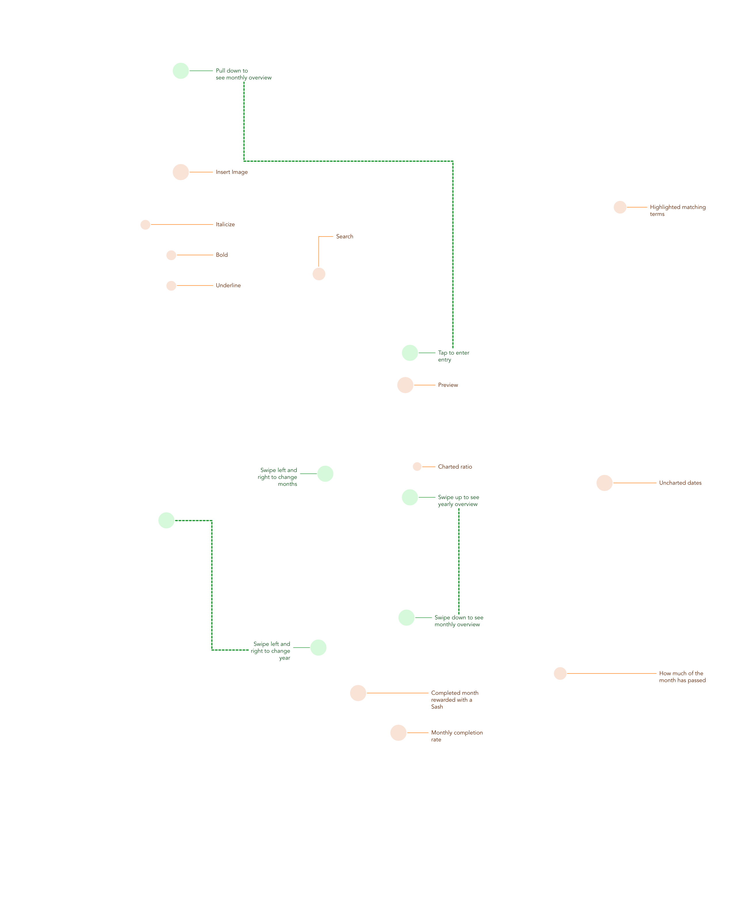
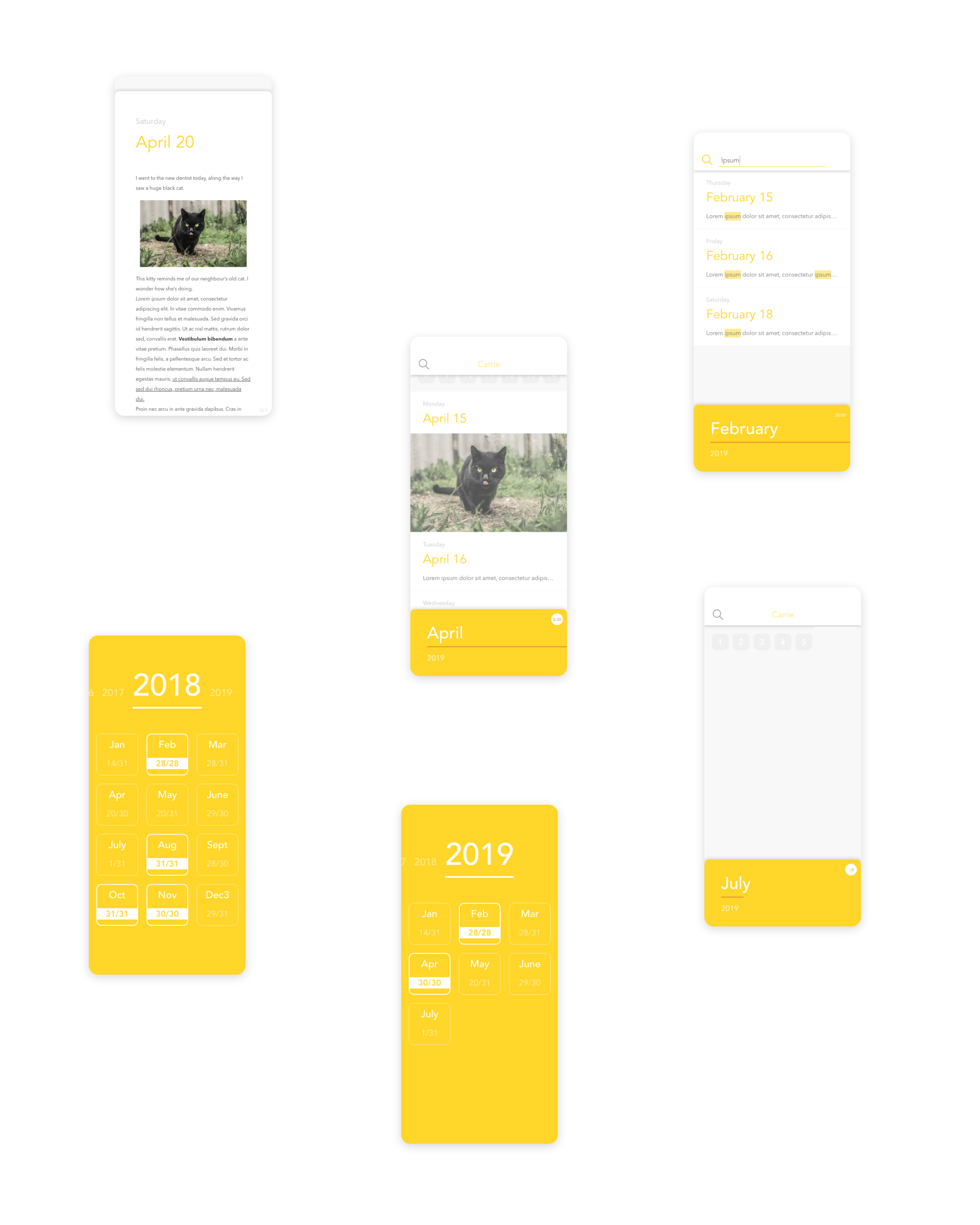
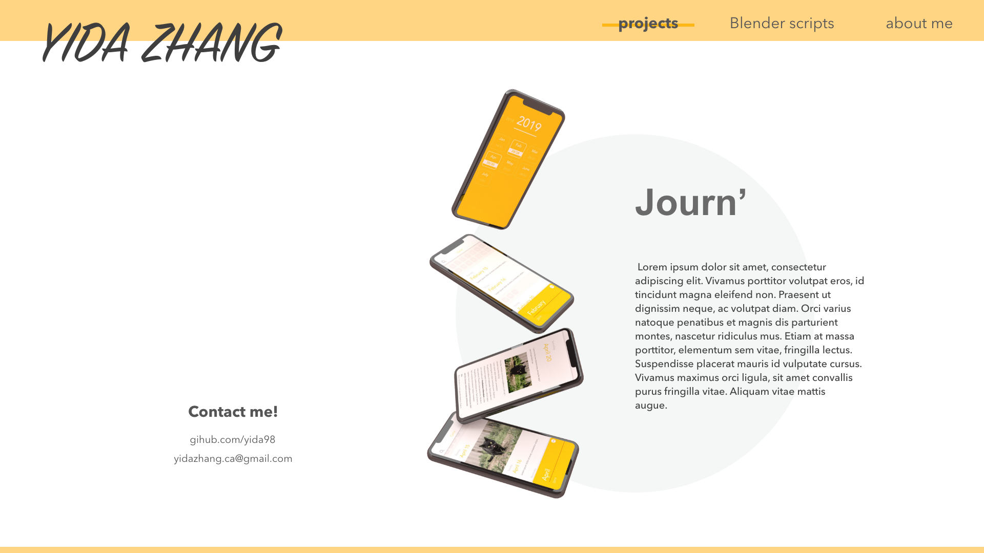
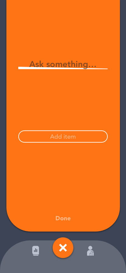
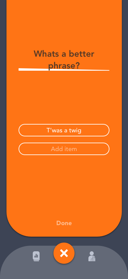
The app has very few views. It centers around the monthly calendar where the user can open up entries and edit them. Swiping left and right navigates the user's journal at the monthly granularity. Swiping up on the monthly bar enters the yearly summary of the months and swiping left and right on them navigates the user's journal at the yearly granularity. There are, all together, three main views and the navigation between them follow similar actions to create callback (i.e. swipe up to open means swipe down to close).
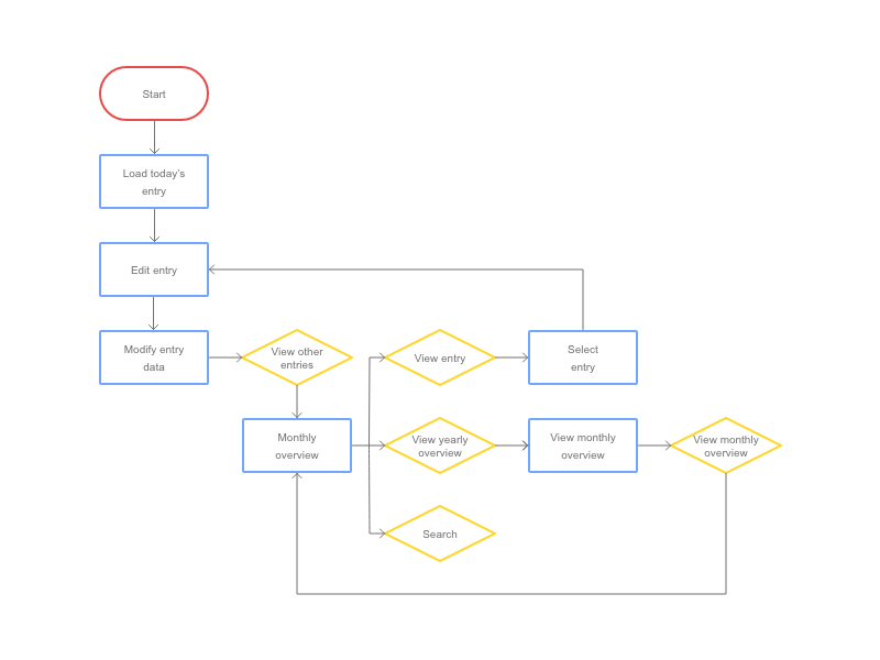
Information Architecture
This IA maps out the simple flow of the app. I wanted there to be very few decisions at every view. Since the structure of the app is so simple, the navigation becomes very straight forward.
Burden Free UI
Each view is clear about what their purpose is and they are visually refreshing but they contain all the necessary tools. The UI doesn't crowd the screen for better aesthetics.
Ethical Incentives
Each month where the user has journaled everyday shows a celebratory sash on that month’s tab. The app is not achievement based where it pushes you to complete all the months because then it piles on extrinsic motivation which can scare the user away. Instead, having the achievement sash as a response to the users’ actions rewards them for something they decided to do via intrinsic motivation.
Implementation
This app was implemented using SwiftUI and CloudKit and the biggest hurdle was making custom, stateless, functional UI and animation with a fairly incomplete SwiftUI library. The code can be viewed here.
Account handling
Journ' synchronizes the user data across all of their devices that has the same iCloud account in a private database.
UI
Journ' handles like a single-page application by stacking custom components. The animation of the UI is tedious to create due to the functional nature of this API which makes stacking and interrupting animation difficult.
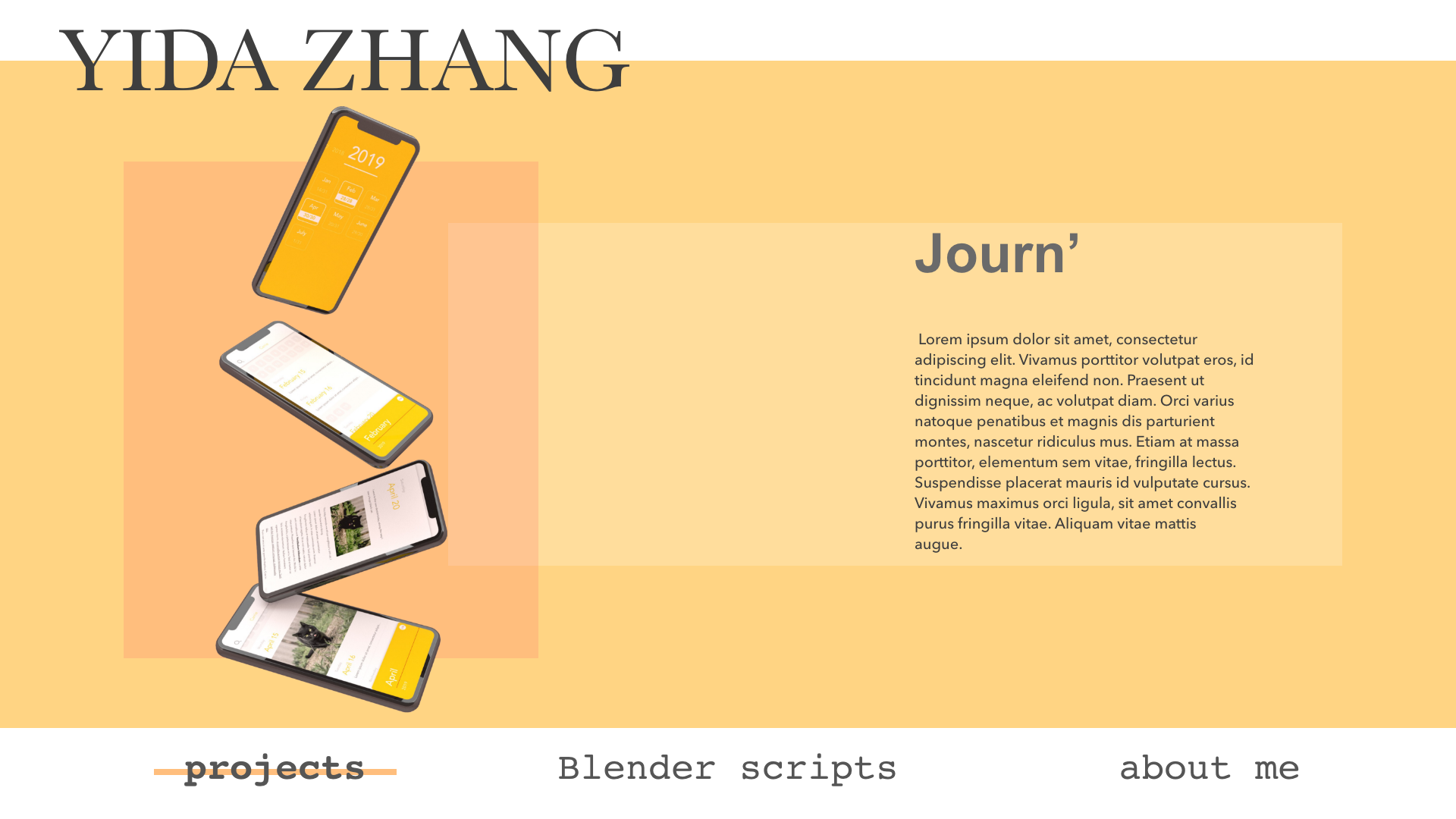
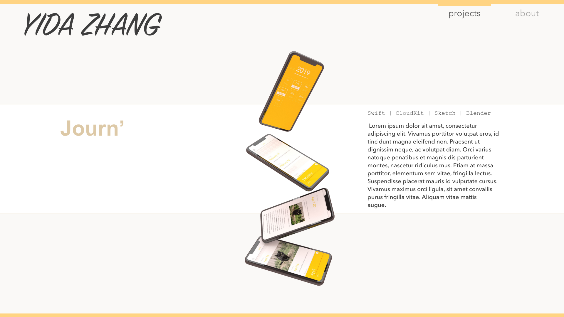
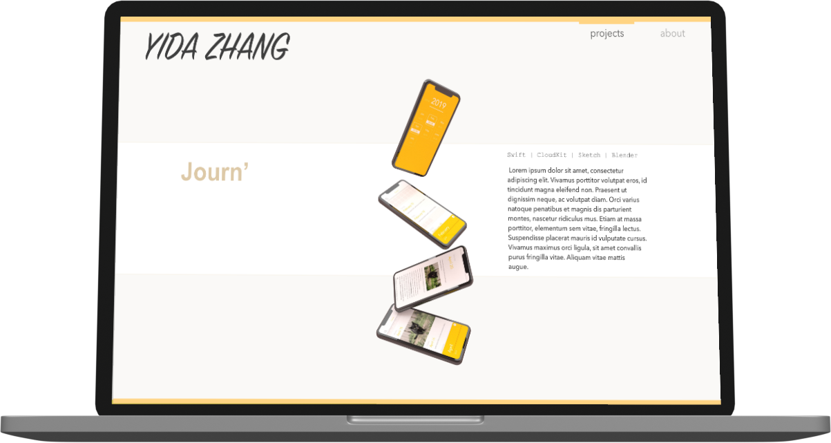
Journ'
Swift | CloudKit | Sketch | Blender
Journ' is an intuitive journaling app for people who just want to keep writing without distractions.
Blender Scripts
Why these tools
This script covers a lot of methods that will be helpful when working on a 3D rig in Blender. A lot of steps in 3D rigging are repetitive in nature yet Blender doesn't provide the appropriate batch operations to complete these tasks due to heavy ambiguity between the objects' attributes, especially while exiting in a 3D environment. While I was working on my 3D animation project, I found myself in need of a lot of batch operations so I went ahead and created them and as I worked on my project, I added more and more methods into the script.
General tools
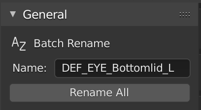
- Batch renaming of all selectable objects including armatures, meshes, edit bones, and pose bones.
This function retains the input name for dynamic reuse.
Bone Operations
edit mode
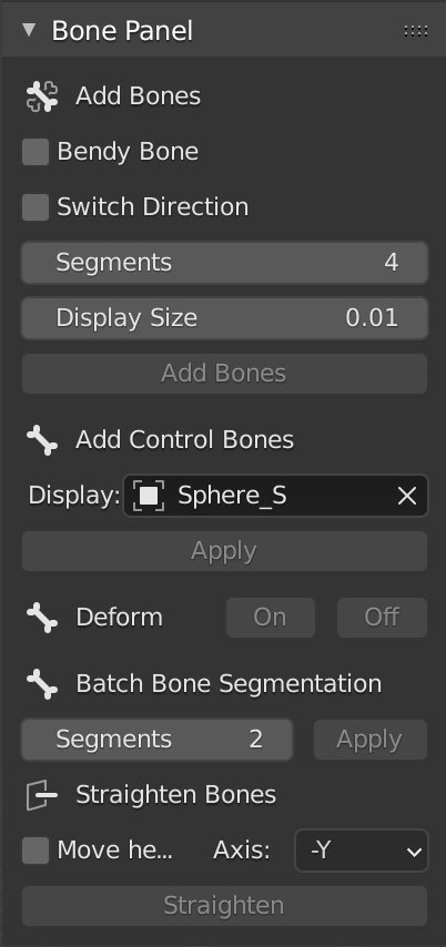
- Add bones method
Given an armature (selected) and an array of selected vertices, primitively add edit bones to the selected vertices.
Customization includes bendy bone (which will extend the customization of segments), bone direction (positive or negative), and bone display size. - Add control bones
Batch add control bones to selected bones with the 'CTRL_' prefix.
Customization includes choosing a pose bone display object. - Batch toggle bone deform
- Batch bone segmentation
Apply segmentation to an array of edit bones. - Batch straighten bones
Straighen the selected edit bones along the selected axis.
Default pivot point is the bone tail but this can be toggled.
pose mode
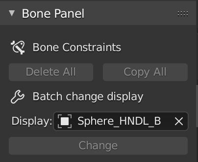
- Batch modify bone constraints
This method can delete all of the bone constraints of the selected pose bones.
Given an array of pose bones, let every bone in the array copy all the bone constraints of the active bone. - Batch change display
From the dropdown, select an existing object in the project to set as the display of all selected pose bones.
Some thoughts
Learning the BPY module wasn't difficult but a lot of the challenge of this project comes from learning how to work in the 3D environment. I never thought I would ever apply linear algebra in real life but that knowledge turned out to be tremendeously helpful when I was working on this project.
Blender Scripts
Python | Blender
An add-on full of tools to help with 3D character rigging in Blender.
My Site
The Designs
The first step to designing a website that doesn't have a heavy backend (e.g. can be easily handled by expressJS) is by designing the UI. Below are a selection of the designs.
I used Sketch and Adobe XD for the layout design and used Sketch and Blender to create the icons and display images. I kept designing while I was implementing this app and eventually settled on the design you're seeing right now.
Implementation
This app was implemented using ReactJS for the frontend and expressJS and MongoDB for the backend. I didn't use a template to design the layout and animation; instead, I wrote it in good, old CSS and JSX.
Challenges
After being pamper with SwiftUI, ReactJS was a bit of a nightmare to work with. The biggest difficulty was stacking animation during transitions considering I was using declarative components. Luckily, through trial and error, I built some hacky solutions that aren't pretty but look flawless.
The backend was a breeze using the typical MERN setup as this site is not too data heavy.
You can view the code for this app here.
My Site
ReactJS | Express | CSS | Git
A website to display my projects; you are here.
Poll App
This is a fun little project built using (my favourite) SwiftUI and CloudKit and designed using Sketch.
Synopsis
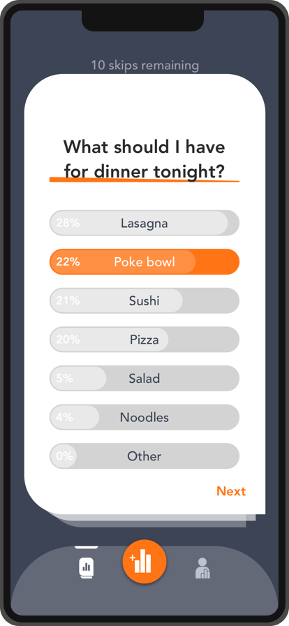
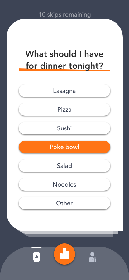
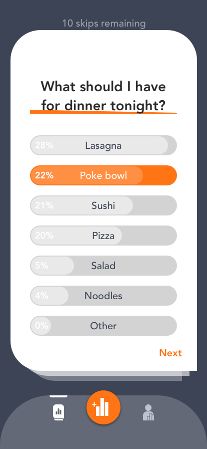
Poll App is an app where you can vote on an unlimited supply of polls. The unlimited supply comes from user submitted polls. When a user submits a poll, they can keep track of the progress and delete the poll when they decide to. The entire process is completely anonymous so there will never be any concern of maintaining a profile.
Designs
The design of this app is very lightweight with a minimal. There are only three tabs that transition between their corresponding modal components. Below are some of the designs I made for this app:


Implementation
I implemented Poll App using SwiftUI for the frontend and employed CloudKit for the backend.
The challenge
Just like with most of my designs, I put a heavy emphasis on having a smooth and tailored animation; however, SwiftUI's UI capabilities are fairly weak and so I had to create a lot of custom classes (that weren't that flexible, had to depend on wrapping Swift objects) and animations to get it to display how it was designed.
Some thoughts
I love the work flow of declarative UI and while SwiftUI is a wonderful tool anyone can use to make some simple apps very fast with very little code, it is still living in the shadow of its predecessor due to its limitations for scaling and customization. As a designer who loves to work with transitions and a developer who loves to make things work, I look forward to the day SwiftUI becomes as flexible as UIKit was.
You can view my app here.
Poll App
Swift | CloudKit | Sketch
Let strangers make your decisions for you, anonymously.